

Christopher Wolgast
Design Critique #1
Website Design 1
Mr. Christopher Harper
3-30-26
Poor Design
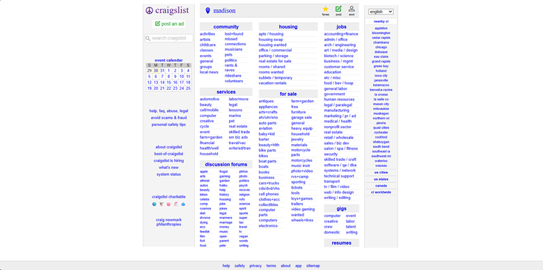
https://madison.craigslist.org
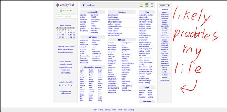
Overall design: The intent is clear: present all the information the site offers in plain text, grouped under simple, broad categories and generic headlines. However, the overall look lacks aesthetic appeal, which is a necessity in modern design. It almost appears as if the website was assembled by an amateur 20 years ago who never bothered to update it with the times.
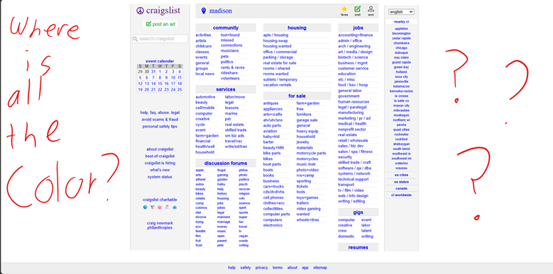
Personal Rating: 2 out of 5
Navigation: Upon first loading the website, you immediately are met with a broad range of categories grouped under consistent, parallel headings such as “for sale,” “jobs,” “services,” etc. All your options are immediately put before your eyes in a simple format, if not stylistic. The site could take a little improvement from drop-down menus, leaving more space for site personalization.
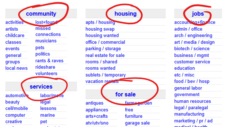
Personal Rating: 2 out of 5
Functionality: All the links and menu options perform their desired tasks with ease, taking the user to a wide array of buying options quickly and efficiently. Clearly, the success of the site is due to its practicality, not its stunning design.
Personal Rating: 4 out of 5
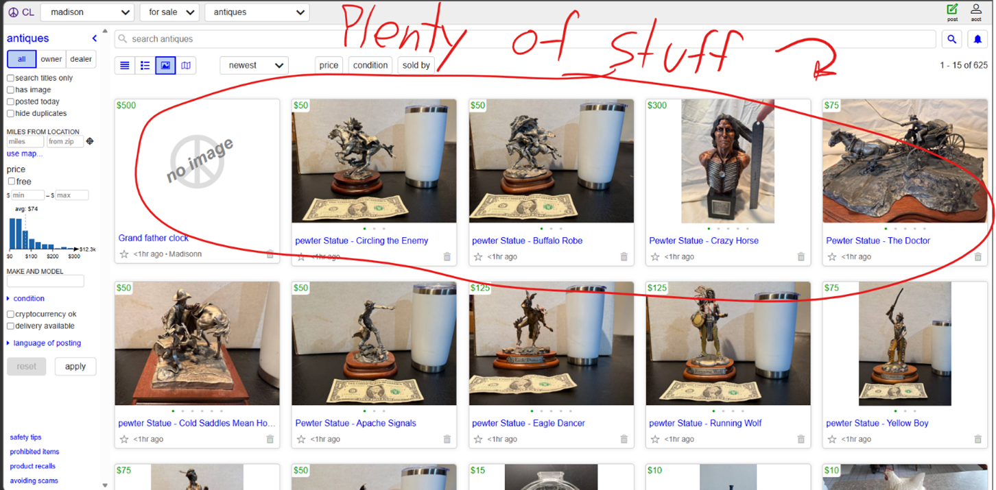
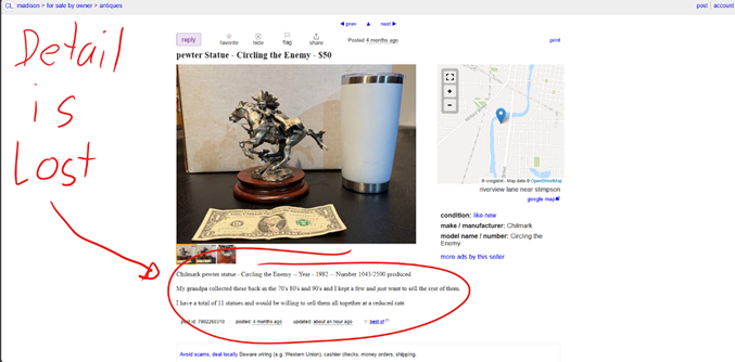
Content quality: The content is displayed quickly and effectively: however, it is not desirable to the eyes, and in its simplicity, vital details and reader-appeal is lost. The articles display simple pictures and details, but the site’s functionality ends before real detail can be determined.
Personal Rating: 2 out of 5
Site effectiveness: Clearly, the site is effective is if thousands of people are using it regularly to buy and sell goods and services on a regular basis. However, its functionality does not match its atrociously stuck-in-the-past early 2000s design, and thus its effectiveness is balanced out by its outdatedness.
Personal Rating: 2.5 out of 5
EXCELLENT DESIGN:
https://www.facebook.com/marketplace
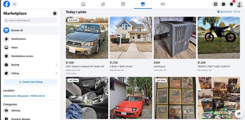
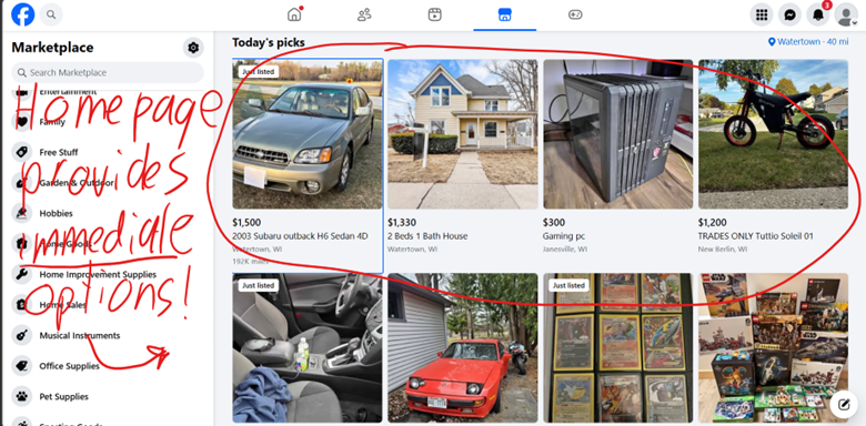
Overall design: The design is very modern, and dropdowns conceal information behind simple categories that do not overwhelm the viewer. The purpose of the website is not extensive, it is limited to just buying and selling products rather than offering a wide range of services, but the simplicity is what gives it its appeal, as well as its modern and efficient reaction times.
Personal Rating: 4.5 out of 5
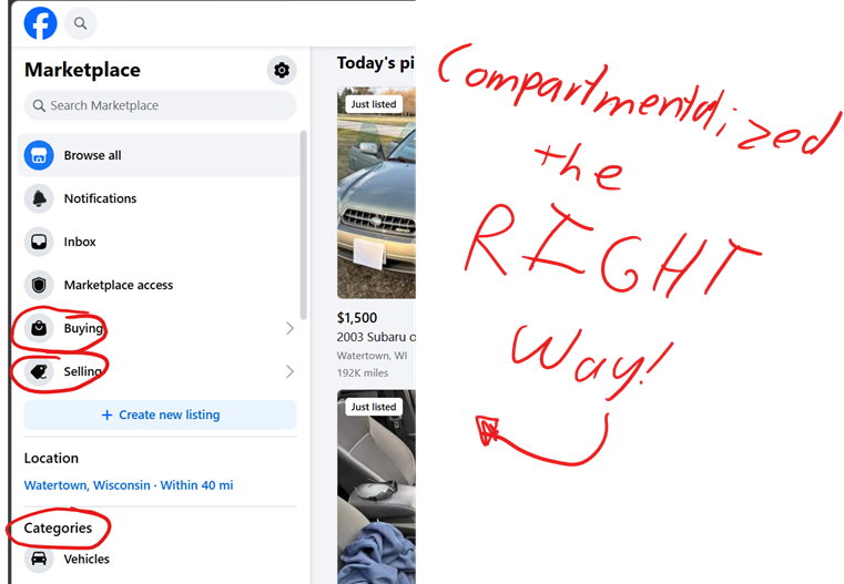
Navigation: The navigation bar is along the left side and is ranked by priority and boasts a replete list of useful functions for the website viewer. A wide variety of simple categories are listed along the side, and a handy search bar is waiting for every specific request. Access to Facebook’s other social media aspects is also suggested along the top menu bar.
Personal Rating: 5 out of 5
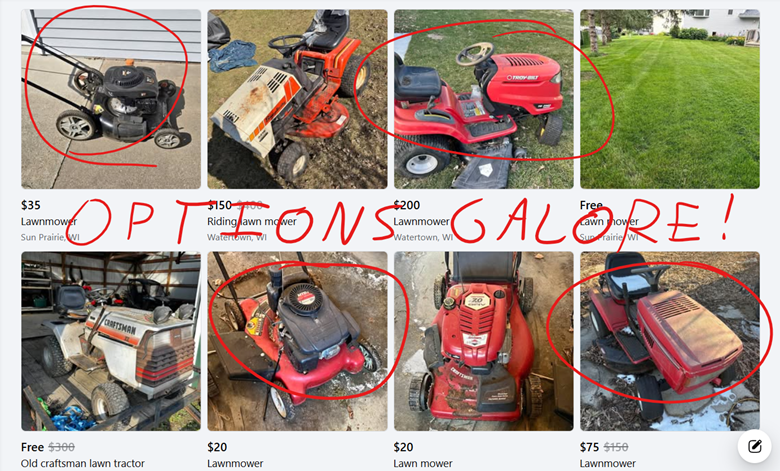
Functionality: Facebook marketplace is likely one of the most commonly used classifieds websites in America. As someone who has seen and heard of its successful implementation from everything from Trucks to dirt bikes to even the Lawn mower I use to this day, I can personally vouch for the functionality of the search and contact information provided by the site.
Personal Rating: 5 out of 5
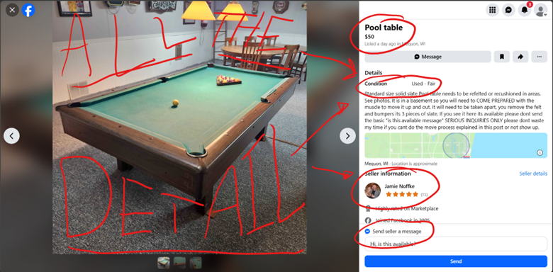
Content quality: The content loads quickly and in no short supply, offering the viewer the age, color, milage, wear and tear, appearance, effectiveness, and many other factors with the click of an image. Seller data, map location, and a direct messaging channel also provide the website user with all the tools needed for performing an effective transaction all in one location.
Personal Rating: 4.5 out of 5
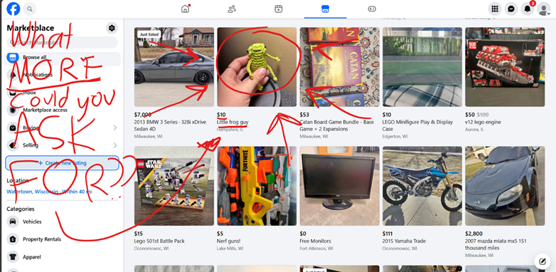
Site effectiveness: The site’s features lack almost nothing in modern appeal. The design of the social media platform is simple and timeless, the navigation is seamless and stress free, and the site offers all the aspects of marketing and communication that one seeking to buy or sell online could desire.
Personal Rating: 4.5 out of 5
Leave a Reply