
Christopher Wolgast
Design Critique #1
Website Design 1
Mr. Christopher Harper
4-13-26
Bad design:
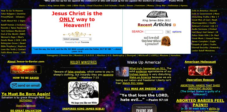
https://www.jesus-is-savior.com
Overall design: Upon first opening the site, the first noticeable thing is the excessive information overload that hits your eyes, as well as the unattractive yellow typeface. The tone seems a bit overbearing and aggressive, and the layout suggests that the makers of the site do not have the talent to back up their passion.
Personal Rating: 1 out of 5
Navigation:
The presence of some semblance of a navigation bar at the top of the page is where my praise for its navigation ends. The information overload is not eased up by in dividual tabs, and a lack of hierarchy makes the navigation bar itself indifferent in color, size, and importance to the rest of the text on the page.
Personal Rating: 1 out of 5
Functionality:
The site runs smoothly and mostly with no malfunctions. The links work. However, without hierarchy, maneuvering the site’s excessive information is difficult and unhelpful. Where the linked text ends and the body text begins is hard to assess.
Personal Rating: 2 out of 5
Content quality:
The content is not presented in the friendliest way. The tone seems to indicate, “this is the truth, whether you like it or not.” Most of the articles and sections seem to foster interest through shock value and exclamation marks. The text is distracting colors on contrasting backgrounds.
Personal Rating: 0 out of 5
Site effectiveness:
I’m not sure who this site is aimed at. If its meant for ministry, this is one of the biggest turnoffs for Christianity that there can be. It just seems angry with no outreach, being angry rather than reaching out in love. The information seems to be targeted at a very narrow subset of people, Patriotic KJO creationist libertarians. While that may be a legitimate audience, they are certainly not being served well with this atrocious website design.
Personal Rating: 1 out of 5
Good design:
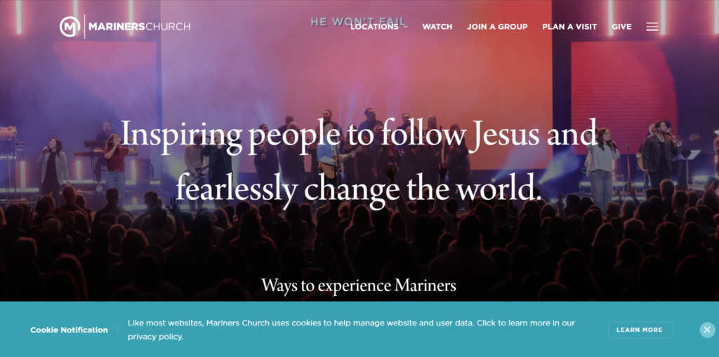
https://www.marinerschurch.org/
Overall design: Upon first opening the site, the first noticeable thing is the simple text statement that sums up the point of the whole site, rather than trying to pack the entire philosophy and ideology into the main page. Calm colors and calm text statements bring a sense of peace and relaxation to the reader.
Personal Rating: 4.5 out of 5
Navigation:
The first tab on the hamburger menu is the about page, loud and clear. The website’s intentions are made very clear, and the information is presented in a coherent hierarchy. Scroll down a little more, and helpful tabs already give the basic information about church locations and events without much effort.
Personal Rating: 5 out of 5
Functionality:
FAQs frequently pair with events and information, responding quickly to each page and providing more than adequate details about all the necessary aspects that the site attends to. The animations and slideshows and videos all run smoothly and immediately.
Personal Rating: 5 out of 5
Content quality:
The content is concise yet informative. It provides just enough for the reader to navigate through the site in a stress-free experience, receiving information without excessive angry exclamation marks and over the top shocking headlines.
Personal Rating: 4 out of 5
Site effectiveness:
The site is a church site, and it gives much information that is helpful. However, a login blocks some pages, and some of the typefaces are outdated. However, it does not fail to serve the church family that it was created for, and without barely any digging, I know exactly how to attain the information I desire about it.
Personal Rating: 4 out of 5
Leave a Reply